
For the fifth day of our Microbial Advent Calendar I wanted to start with: Yersinia pestis, the party crasher of 1665 that pretty much ruined Christmas and everything else in London during that year and the following one. Although it did ruin everything, while reading about it I realized it was not happening only over the winter. The plague was still there by then, but the peak happened during the previous fall.
What is interesting about that particular plague? It wiped out an estimated 20% of London’s population at the time, but what is cool for data analysts today is that they recorded the number of deaths with their causes on a weekly basis. For modern historians, statisticians and nerds this is a little throve of information and data to play with!
The 1664-65 Plague
During this era, London wasn’t really a nice place to be. The city was around 180 hectares, surrounded by walls. The poorer district of the inner city had overcrowded infrastructure and no hygiene. Waste of all kinds was deposited directly in the middle of the street where “rakers” removed the worst of the filth to be transported to mounds outside the walls, where it accumulated and continued to decompose.
Outside the walls it wasn’t better, the already overcrowded city was surrounded by large suburbs which were mainly large shanty towns with wooden houses, no sanitation and infested by rats.
In brief, it had all the conditions for a good epidemic.
The exact origins of the epidemic are quite unclear, but it is thought to originate from a plague outbreak which ravaged Amsterdam at that time. One hypothesis is that the plague arrived with a shipment of cotton balls from the Netherlands sometime in 1664. Some suspicious deaths happened in late 1664 and early 1665, but were not officially declared as plague deaths, partially due to medical practitioners who had never seen what the plague looked like.
The bills of mortality
Originally introduced very intermittently from 1592 to 1595, the mortality bills had the purpose of monitoring the weekly deaths in each London parish (a part of the city attached to a diocese), caused by the previous plague outbreaks in the city. It was then done continuously from 1603, and in 1611 the responsibility of producing the statistic was chartered to the Worshipful Company of Parish Clerks.
For the 1665 plague, the best collection of numbers comes from the work of John Graunt, one of the first demographers in London. He collected all the mortality bills relative to the plague outbreak in a report titled: “London’s dreadful visitation: or, a collection of all the Bills of Mortality for this present year: beginning the 27th of December 1664 and ending the 19th of December following: as also the general or whole years bill. According to the report made to the King’s most excellent Majesty” (This is available in its entirety on the Wellcome Library website here). From this work, he also estimated the population size of London and surroundings to be around 460,000.
These reports had, however, some serious flaws and biases. Firstly, they were only recording the burials in the Church of England churchyards and not actual deaths. Therefore, people from other faiths were often not included in the bill. Secondly, the records were also often tempered with by clerks not wanting to have their parish associated with the plague or people not wanting to disclose that someone with the plague was in the family, as it meant being locked up in the house for 40 days for quarantine.
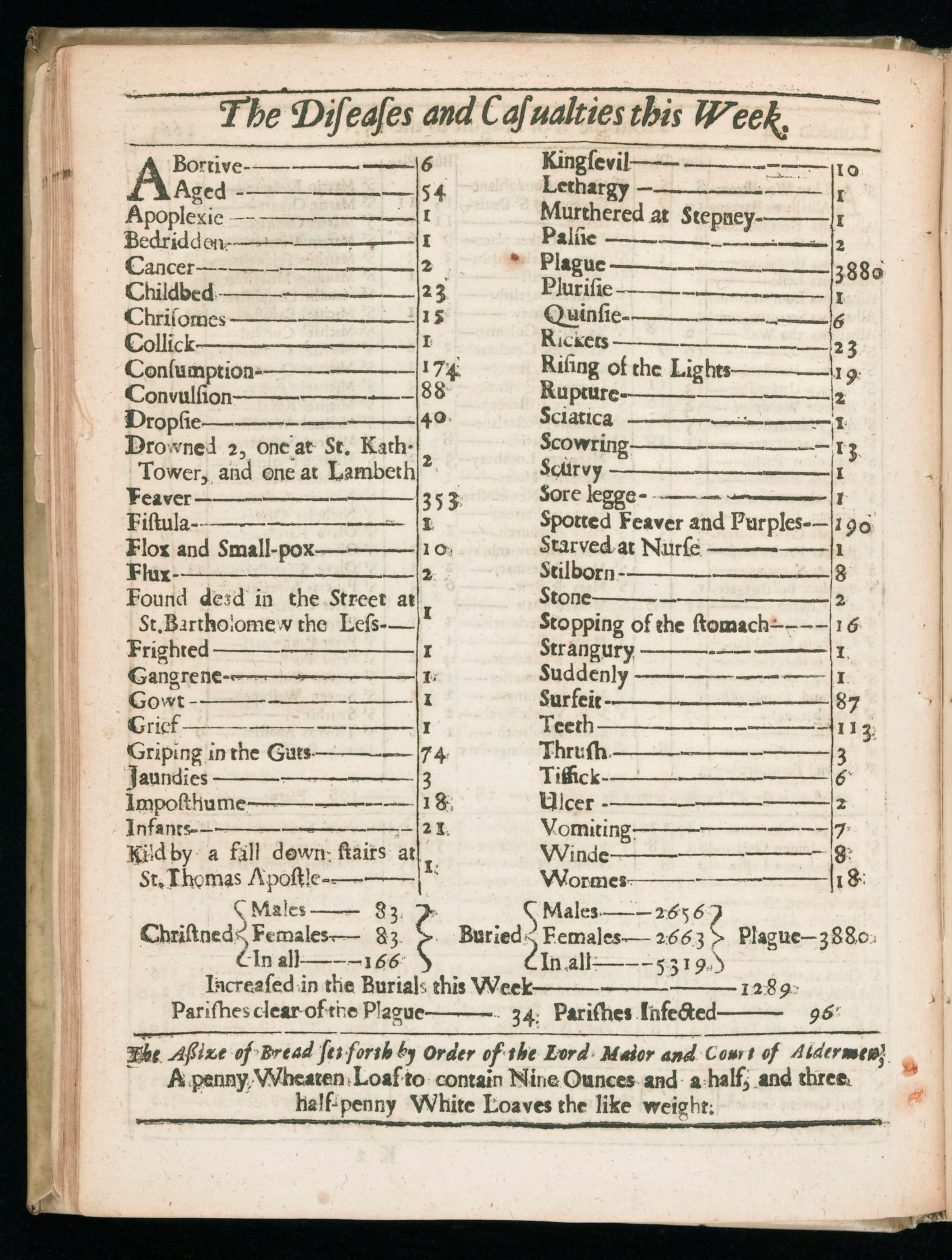
Example of what a bill of mortality looked like, note that more than one person died of “stopping of the stomach”.
Source here – Wellcome Library collection

Visualizing the data
So here we are. There are weekly statistics on how many people died in 1665 with a geographical resolution to the neighborhood. I was sure that someone must have already had a look into this and the data must be available in another format other than a pdf scan of an old book.
And of course, someone already did an amazing job on this topic. Neil Cumming, an Associate Professor of Economic History at the London School of Economics, Cormac Ó Gráda and Morgan Kelly Professor of Economics at the University College Dublin. He published a paper on the exact topic: “Living standards and plague in London, 1560–1665” available here. And even better, all the data used to produce the paper is availble on his very nice website here.
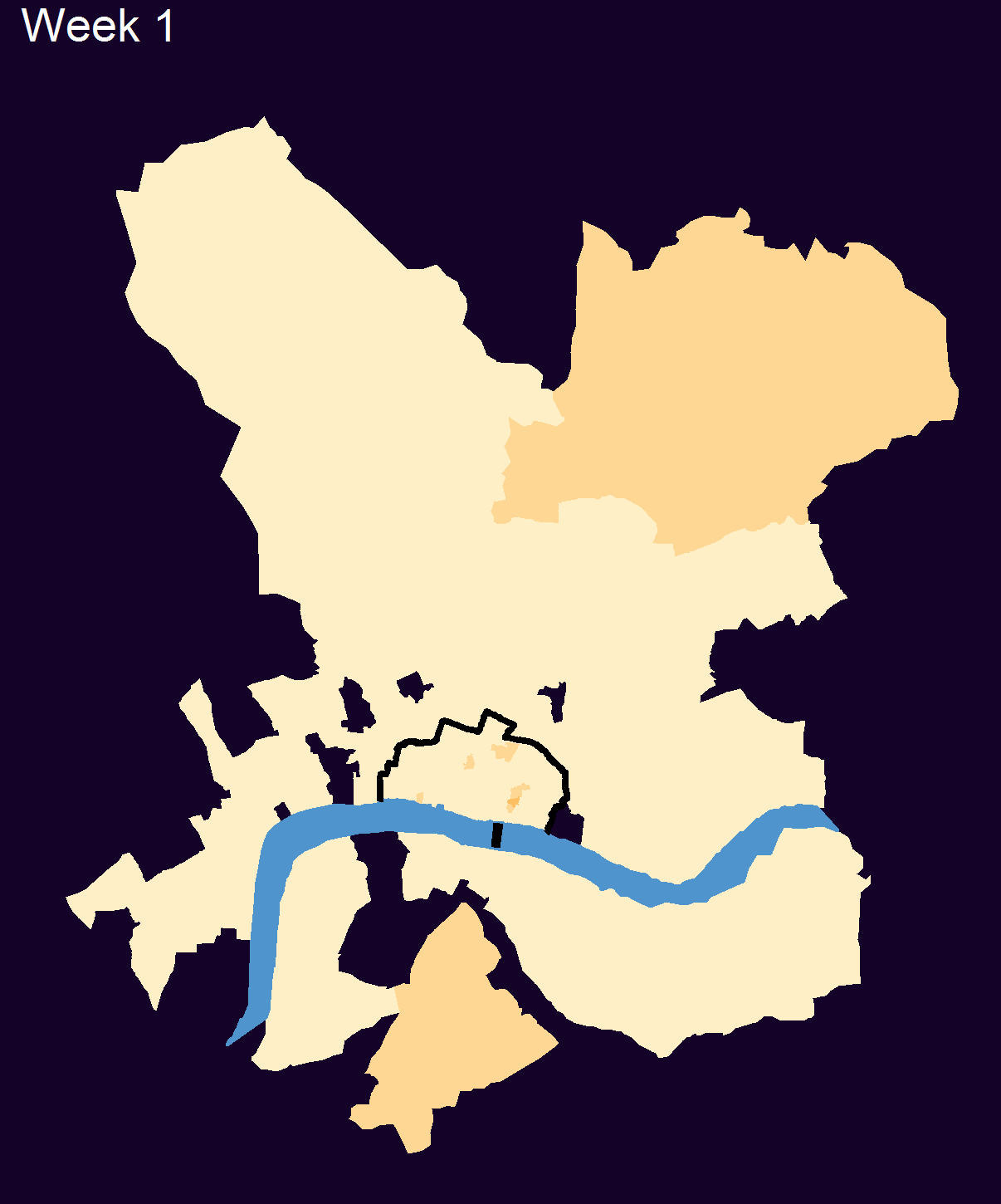
This is the data that I used to regenerate weekly maps of London showing the spread of the Plague during 1665. The map does not show the number of deaths but rather different levels of mortality crises, calculated by Cumming et al. Because the offical records are likely to be not entirely reliabe on the exact cause of deaths, the number of deaths (even if not counted as plague) still indicate an anomaly spike in certain Parishes. This is how the data is represented on the left, with 5 different levels of crisis indicating abnormal increases of deaths. The paper also has a rather interresting graph (Figure 7) showing the annual deaths, and proportion of deaths in excess of the normal standar ratio.
The map shows the evolution of the plague, ravaging first the outer city Parish before passing the walls and infecting the inner city neighbourhoods. The spread show that even in the scenario of the plague coming by boat, the early infection center was “St Gilles in the fields” actually located away from the port, which is at that time the “Pool of London”, located in the inner city. This opens curious questions about the orgin of the plague, did an infected docker travel and die all the way from the port to St Gilles, or did the infection spread through rats during several months and burst out in the outer city?

St Gilles in the fields, where the outbreak starts
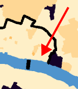
Where the port, the “Pool of London” is located
In any case this is a beautifull dataset, which allows a nice resolution to visualise the plague through London and is openly availble to anyone who wants to play with it! I recommend to read the Cummin et al. paper where they also look at the mortality and birth rates around the plague event and also at the relation of the disease with the “wealth” of the different neighborhoods.
Finally, coming back to our Microbial Advent Calendar, we can see that around Christmas the City of London was actually recovering from the plague with fewer deaths recorded. So I guess it could be considered as a good thing for Christmas at that time. London would not be spared for the coming year with the Great Fire of London devastating the city in 1666. The fire destroyed most of the poor quarters of the city and is ironically thought to have played a role in getting rid of the plague in London, as no outbreaks were recorded after it.
Join the discussion One Comment